

Posted: 8 years ago
New Year, New Color Trends
Take a look around. What colors do you see? Do they intrigue you? Confuse you? Or perhaps make you feel warm and welcomed?
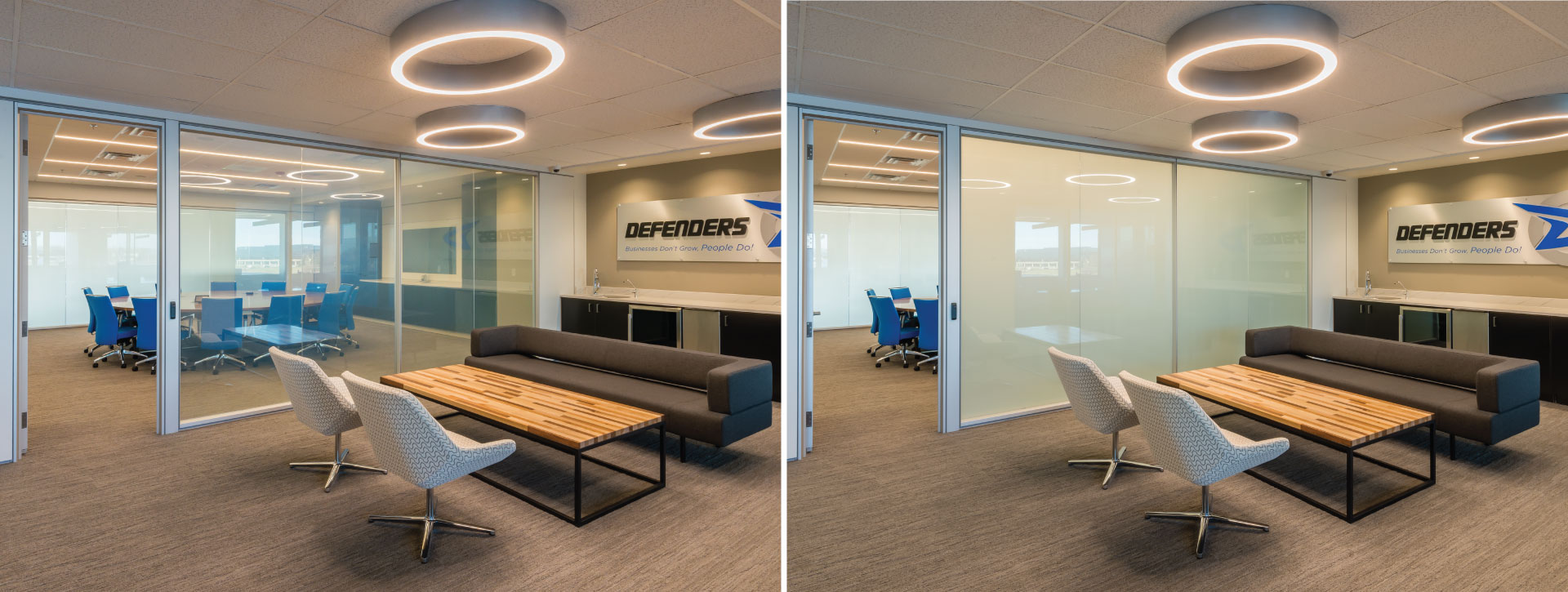
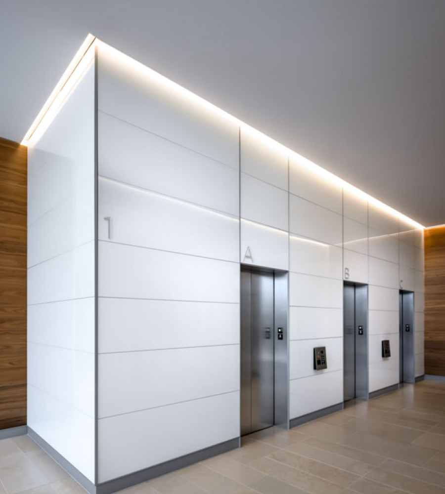
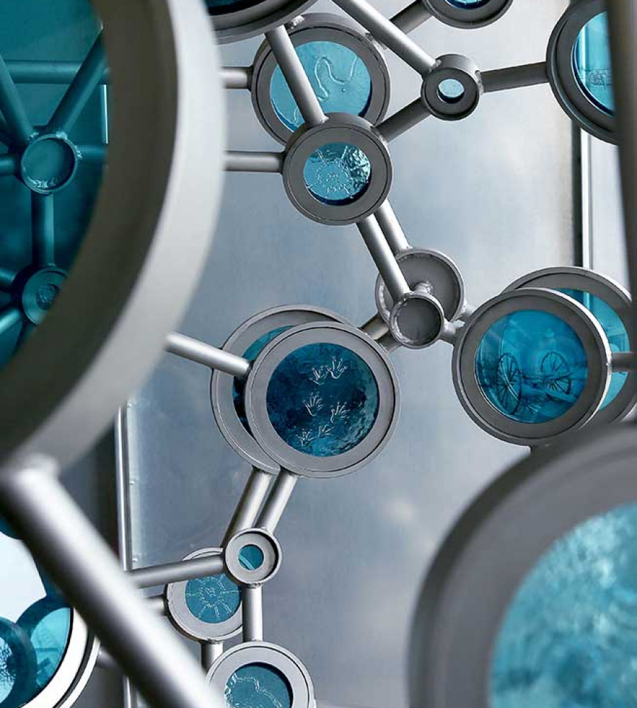
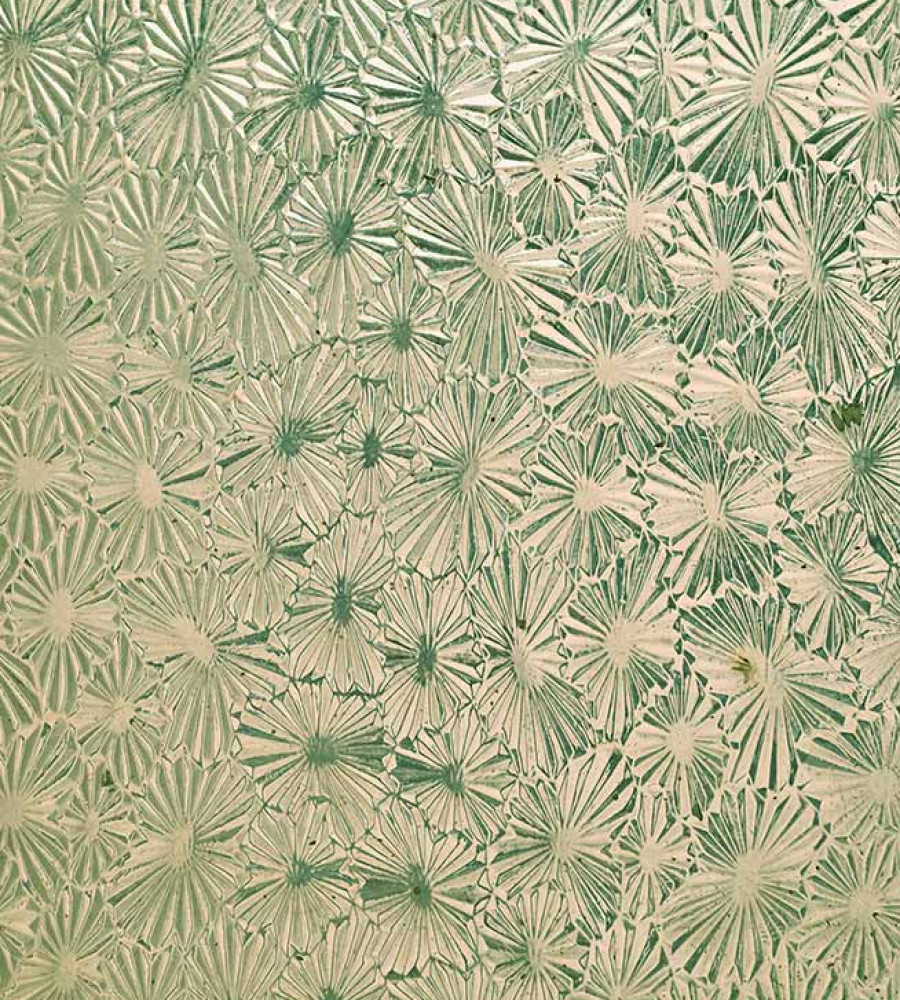
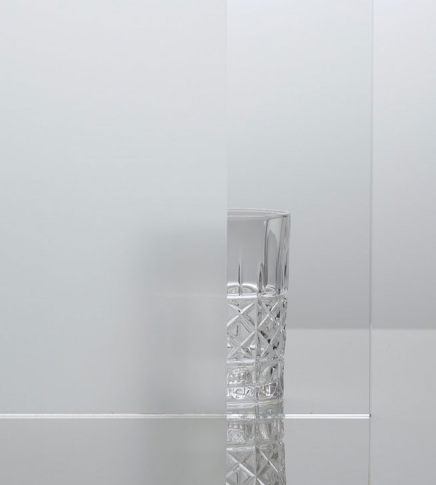
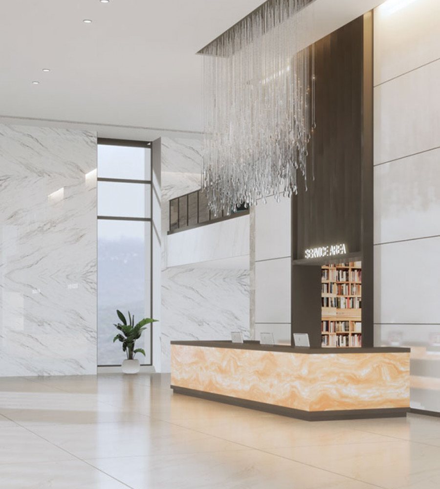
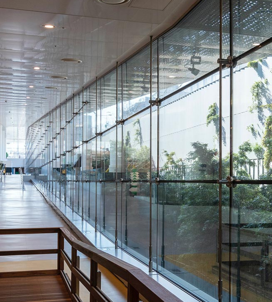
Color is the very roadmap to who a brand is and what they want their space, structure or design to represent. Glass is one of the most versatile building materials in the world. For centuries, colorful pieces of decorative glass have been used to help define some of the world’s most iconic buildings and structures – from churches, castles and museums to libraries, residential properties, and everything in between. Other than supporting the function of a design and its overall visual appeal, the right color or combination of colors have the ability to engage imaginations and evoke a powerful mood, influencing the very way people feel about your design, your brand, and ultimately, you.
In the decorative glass world, color plays a vital role in helping to bring projects to life in the most inspiring ways. Each year brings new designs, trending color palettes and upcoming uses of decorative glass. 2018 brought us iridescent colors, new neutrals and bold use of pinks. Now with the release of Living Coral, Pantone’s Color of the Year for 2019, new design trends are also beginning to emerge in the architecture and design world – ones that use color to capture attention and stimulate an emotional response.
Here are our top three color trends for 2019.
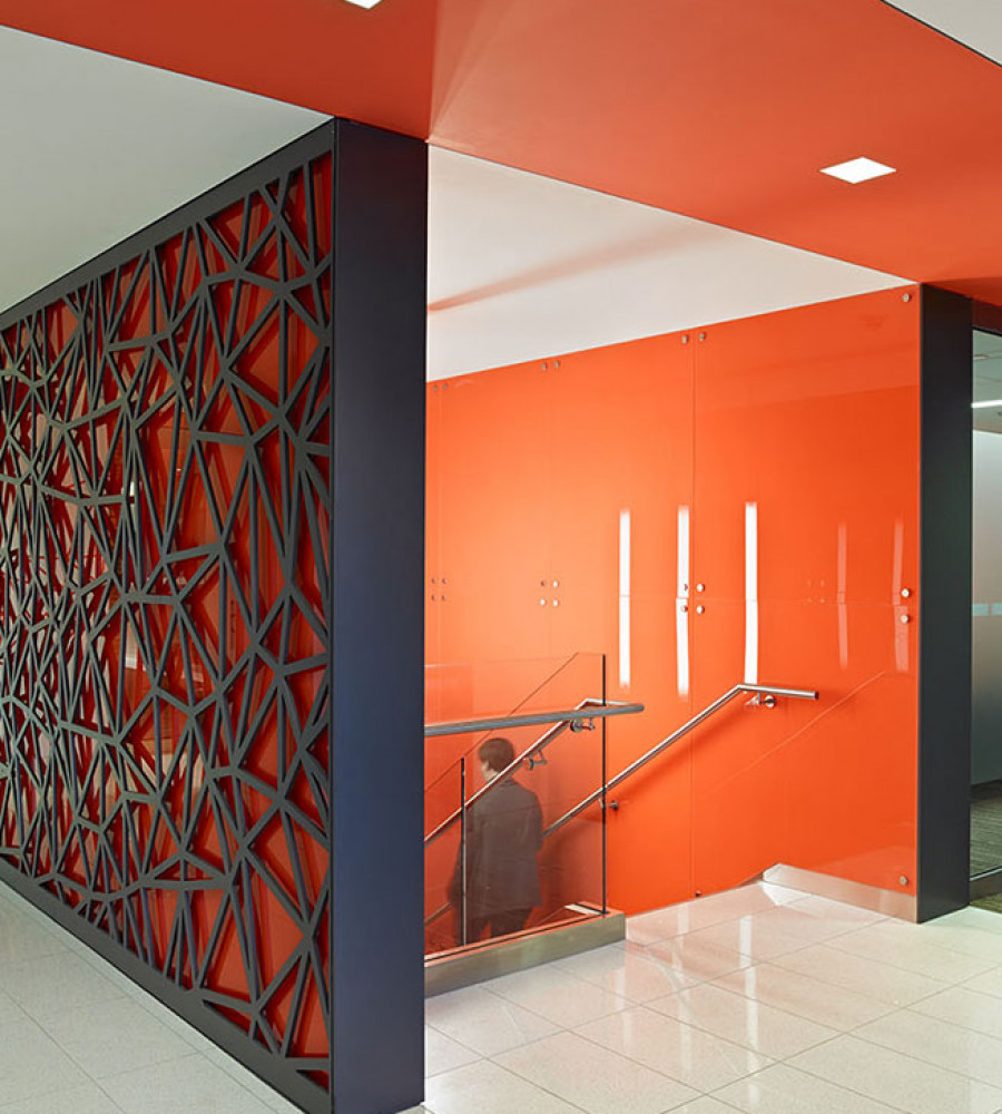
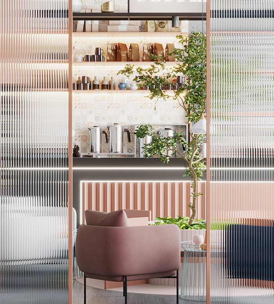
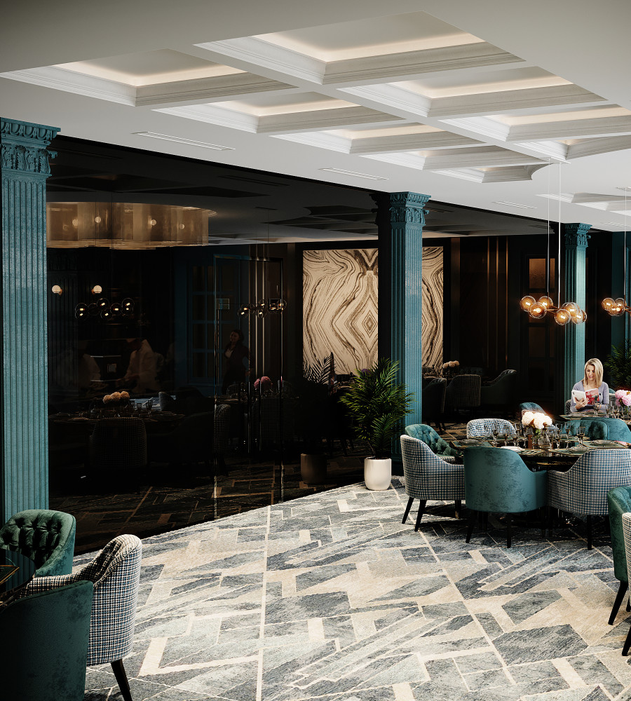
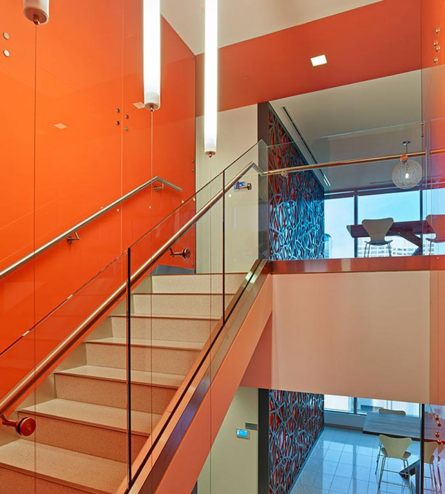
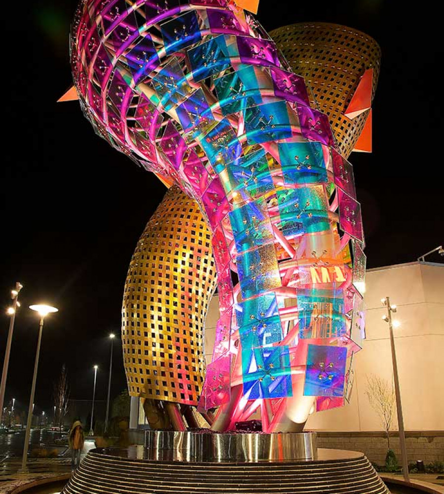
1. Brighter, More Vibrant Colors
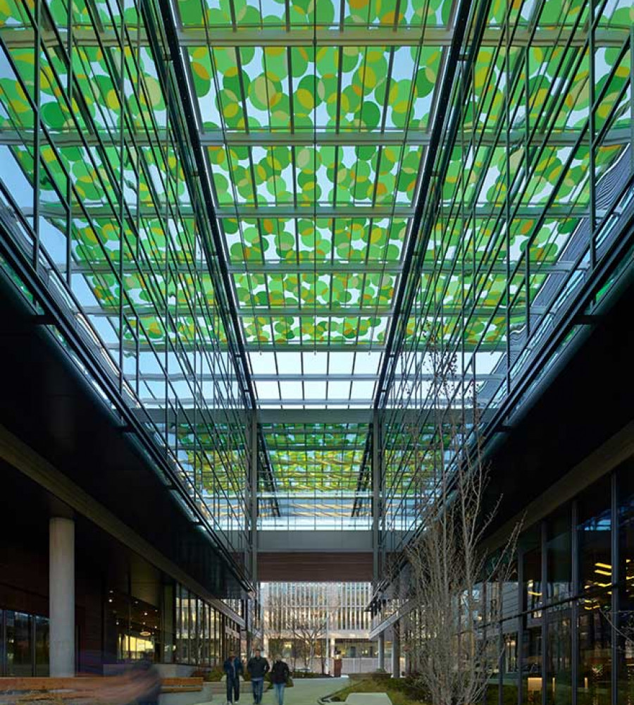
Using decorative glass to introduce brighter, more vibrant colors into a space or design is an effective way to add to an aesthetically pleasing look and make a bold impression in 2019.
The Pantone Color Institute recently announced Living Coral as its color of the year for 2019. According to Pantone’s Vice President, Laurie Pressman, “Color enhances and influences the way we experience life. As a shade that affirms life through a dual role of energizing and nourishing, ... Living Coral reinforces how colors can embody our collective experience and reflect what is taking place in our global culture at a moment in time,” (check out our past blog on how the Color of the Year is chosen).
To compliment Living Coral – an energetic and sociable coral hue with a softer, more intimate edge – PantoneView Homes + Interiors 2019 revealed an additional 72 on-trend colors across eight palettes. While palettes such as ‘Cravings’ (rich reds, sweet oranges and vibrant purples) as well as ‘Classico’ (deep teals, burgundy reds and deep black) are designed for indoor spaces, Architecture and Design anticipates that these shades are likely to quickly flow into exterior design too, making them colors to pay attention to in 2019.
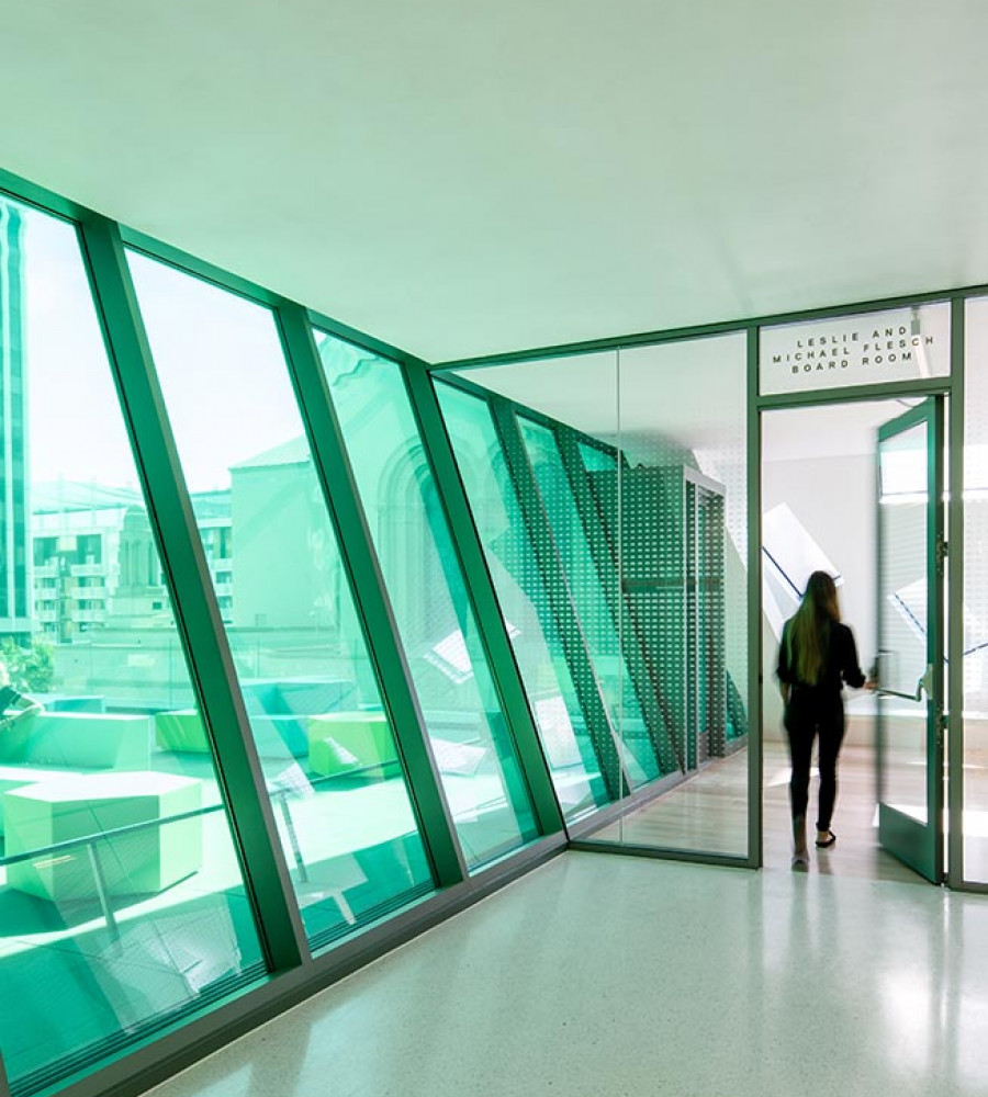
2. Bringing the Outside In
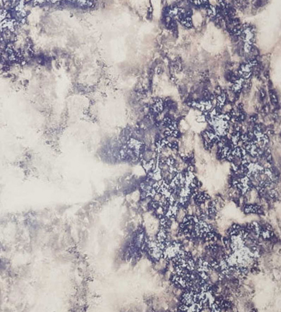
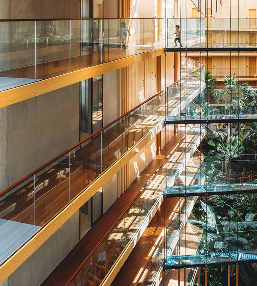
Tying into the trend of using brighter, more vibrant colors, some architects and designers are beginning to use nature as their inspiration for color. Earthy hues like warm terra-cottas, mid-tone blues, calm greys and classic greens are beginning to become more prominent to help “invoke the invigorating impact of nature” in design, according to Architect Magazine.
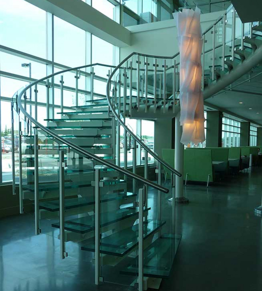
Natural elements and nature-inspired tones began gaining traction in the end of 2018, and is something we expect to become even more popular. For example, the design of Calgary’s new Central Library, which opened its doors in November of 2018, uses sustainable materials including natural wood to add warmth, wooden ceiling slats to add dimension, polished concrete, large windows and metal mesh to allow the outside light and lush city views to pass through. Built by architectural firm Snohetta, the library was recently featured in the New York Times as one of the Top 52 places to go in 2019.
In a different approach to bringing the outside in, the recent winner of the 2018 Best Tall Building, the Oasia Hotel Downtown Singapore designed by WOHA Architects, used a wall made of plant life in combination with a bright red branded metal façade to highlight the surrounding beauty of the building. This enabled the design to stand out in a bustling cityscape and bring the lush greenery from its exterior into common indoor spaces.
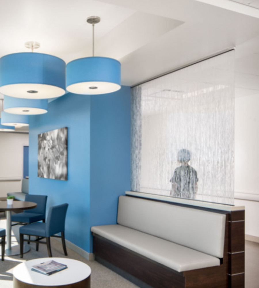
When it comes to helping a space feel open and airy, tasteful use of color with glass can also help bring the outside in, allowing the light to bounce and accentuating the pre-existing nature that surrounds a design. Technographic Interlayers can also be used to easily replicate other building materials including natural elements such as wood or geological textures, making the design possibilities endless. The holistic merging of architecture and nature will be a leading trend in 2019, with decorative glass playing an important role in its execution.
3. Branding, Color and Technology
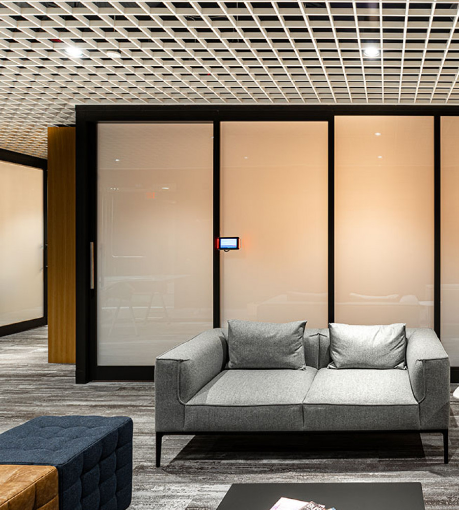
Technology has arguably had one of the biggest influences on branding trends, and when it comes to color, this is no exception. Lately, companies have started to embrace technology, using interactive installations, 3D imagery and state-of-the-art visuals to blur the lines of fantasy and reality and, as 99designs puts it, ‘wow’ onlookers both inside as well as outside a space.
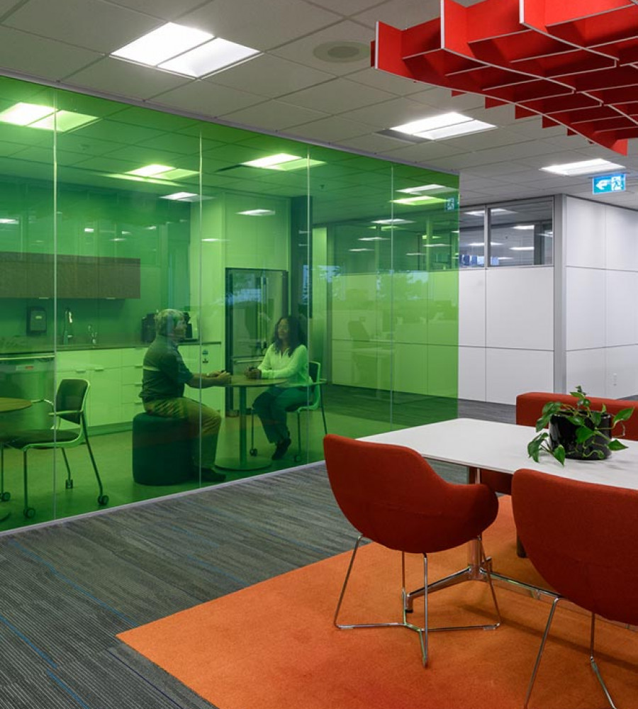
Using color and technology to help brand can influence both the interior and exterior of a space. Intel recently broke the Guinness World Record for simultaneously flying the most unmanned aerial vehicles (UAVs) with more than 2,000 drones. While this stunt was a record-breaking drone show, Intel used the opportunity to showcase its innovative brand in the most creative way – using its brand color across every image created by the drones, including using them to blast its own logo across the skies. Inside, color and technology are also starting to be used to define spaces, encourage imaginative thinking and build brand awareness. This was done by Nokia, whose office spaces use complimentary colors across feature walls, decorative glass, flooring and furniture to help tell their brand story while giving all those who enter an engaging experience as soon as they step through the front doors.
Using color to effectively brand a company, specifically with technology, is a trend that is likely to inspire firms everywhere to raise their standard and find unique ways to help their brand shine. Nokia’s head office was recently named one of the Coolest Offices in the World by BoredPanda – and we anticipate that many forward-thinking companies will follow in their footsteps leading into 2019.
Bring Your Design to Life
Using color to harmonize a design, accurately portray a brand and influence those that interact with a space can be tastefully done through decorative glass. And, we anticipate the three above trends will inspire those who use them to stand up, and stand out.